Hush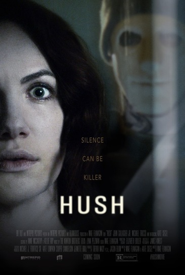
Ouija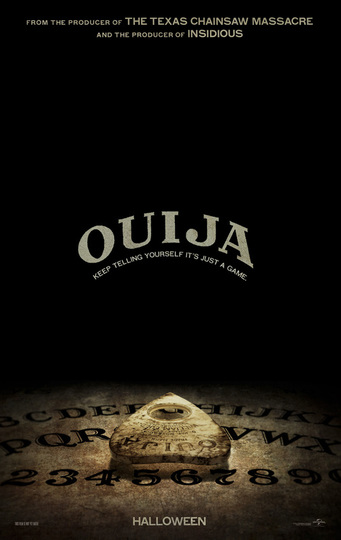
The Purge 3: election year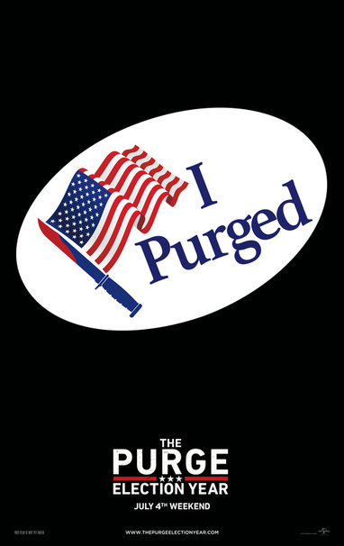
Sinister 2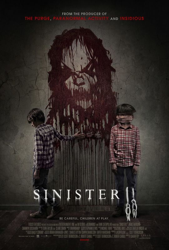
|
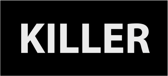
Hush uses a very simple text font to demonstrate the simplicity of the film. The movies premise is that its a simple slasher/stalker movie taking place at a house in the middle of nowhere, the twist is that the victim is deaf, therefore the trailer uses a lack of sound in order to put you in a similar place as the victim. The simple text used in the trailer is slightly different to the text used on the poster as it wouldn't work on a high production poster. We don't like the text used in the trailer as it makes the movie look lower quality which it doesn't give the impression of when you watch the footage.
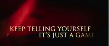
Ouija uses the same font seen on an actual ouija board in order to link the two together even more. We don't like the text used in the trailer as it is very generic and could be used in other movies that are not horror. It is almost unidentifiable as Ouija from the text used in the trailer. The red glow in the background with the gold writing suggests that it could be other genres. This is a problem because they can't use there title font for the text slides in the trailer as it is such an extravagant font more is less. We believe that the font used for the poster is effective and is very strong. These titles are a good lesson for us as if we want to use an extravagant font we will have to find a secondary font to use for all the text cards in our trailer that relate to the film and are still powerful and specific to the horror genre.
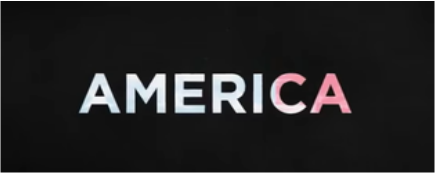
The Purge 3: Election Year uses the context of the presidential elections to add a new twist into its franchise. Therefore its text is based around the theme of the presidential elections. The trailer text is a simple block text which the franchise has always had but this time it has the red, white and blue colours behind it to make it different to previous movies. The text used on the poster is similar to this, a very simple text with a white and red colour scheme and three stars separating the lines of text, another symbol of America. This is effective as it gives this movie a clear distinction between this and the other movies in the series so it feels like your getting something different from last time, This does not relate to our movie as it is not a sequel and is instead a complete story.
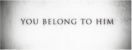
Sinister 2 uses similar fonts for its title and its text. The poster version changes the font slightly to make it more effective and more of an iconic image. The font used in the trailer is quite generic but has the shadow behind it which Sinister text always has but reverses the colour scheme of the text of the poster and therefore has black text with a white background. The title text is quite a simple design compared to most horror title texts which are usually more elaborate and a lot bigger that the font which Sinister uses.
|
