Total film
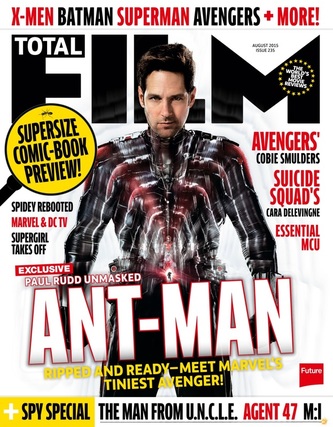
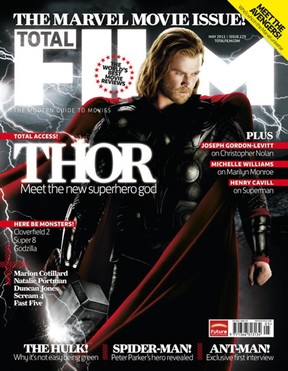
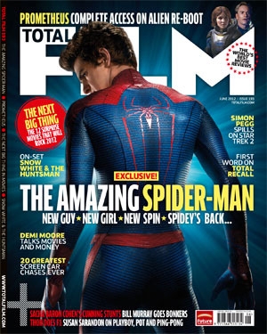
Total Film always has this same layout but changes the colours and pictures to fit what is inside the issue. In this particular issue, there was an article about Mad Max: Fury Road. The magazine has adjusted itself to fit in with the mad max them by having a large picture of the stars of the film on the front with a picture from the film behind them. They have also changed their font colours to whit ad orange to match the colours of the photo and the Total Film writing at the top has rust on it to fit in with mad max. It has the title of the main article in the middle with another article to the diagonal left. It also has a picture in the top right corner linking to another article to catch peoples eyes. Total Film also always has some more articles included in the magazine. These are usually well known names or films so people see them and recognise them and want to read more about them. The covers are always very well presented with a glossy finish giving the impression of quality straight away. The use of the big picture of the characters draws people in as they may know the characters or see them and want to know more about them. Even though the change the theme every issue the core layout stays the same.
Empire |
|
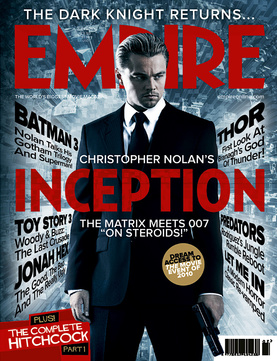
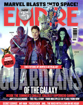
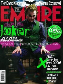
Empire magazine always change their theme very drastically depending on the big film on the front. For this issue it was Inception. Due to this it says in Empire's standard large red font the name of the film and a very large picture of Leonardo Di Caprio who stars in the film. The rest of the cover is also themed around Inception with the grey background of the city. They also have other articles around him that are coming from behind him that use short sentences to attract readers as they see even more content they want to read about by showing the variety of the articles included. Like Total Film it has bold titles for these articles that draw people in as they see names they recognise or have heard of like Batman. Empire always has a tag line above the title about the articles inside. This also has a very cinematic feel with the very high standard of presentation. It uses lots of the same features as total film but has more writing on it compared to the spaced out total film covers
|
|
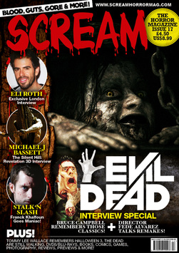
scream
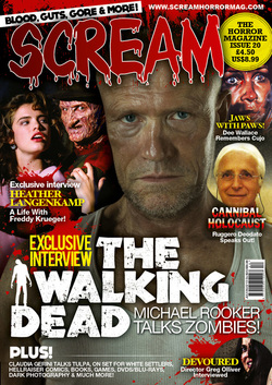
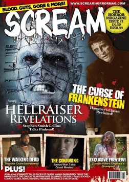
Scream magazine differs from the other two due to various things. Due to it being horror orientated it uses much darker colours and much creepier fonts. It has its title over its pictures which the other two don't. we believe this is down to the other two being a lot more well known so people recognise them without reading the title. It also uses a large picture that relates to the main article in the magazine. It then has other articles dotted around the sides. This uses pictures above the articles to catch peoples eyes. The others don't do this as they use a much larger central picture to Scream. The other magazines use a lot more of a cinematic theme. This is most likely due to their ever changing themes wear as scream is all about the horror genre. It uses various aspects so the audience know it is a horror themed magazine such as the slogan: blood, guts, gore and more!. It also has a secondary picture that is bigger than the others of Freddy Krueger who is an iconic horror character that people can recognise.
|
|
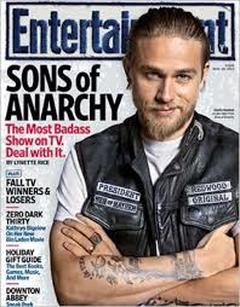
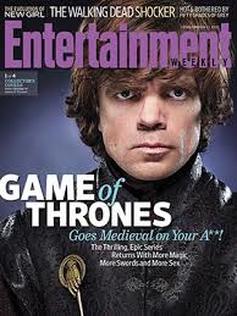
Entertainment
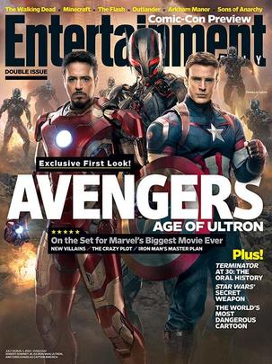
Entertainment is similar to total film in layout. It has a large picture on the front and a background picture tying in with it to fit the theme. It also has the name of the magazine going behind the picture with other articles above it and a short description on the theme of the issue. There is also some more articles down the side so people can find something they want. It also has a caption above the text describing the photo sating exclusive. This will draw people in as they buy this magazine over competitors due to unique content. This seems to be the standard layout for a film magazine.
|
|
conclusion
Entertainment, Empire and total film all have a similar layout with similar fonts and features. scream on the other hand is very different due to its horror theme. The others change their theme every issue so only use a basic font and layout so it can be adapted at will. This is why scream has very dark colours and a very unique font.
