hOW Effective is the combination of your main product and ancillary texts?
Branding is a vital aspect to any film hoping to be successful. Branding is even more crucial in a popular genre. Horror is easily the most active genre due to it being easy, cheap and quick to produce. Therefore effective branding is what separates your movie from the other 10 horror movies coming out that week. Horror movies often use an iconic image or prop but some also use font to distinguish their movie from others.
Key Examples
How we used our research when creating our poster
1. A visually striking image
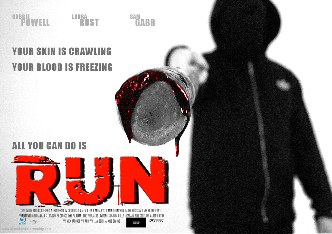
From the outset we knew that we were going to have our killer as the main focus of our poster, pointing the baseball bat at the audience. This is our iconic image due to it being different to other horror movie posters. Most posters don't acknowledge the audience whereas the image we have used gives the impression that the killer is pointing the bat at you.
|
|
Whereas many horror posters are centered around the victim, normally in a state of peril, we decided it would be more effective to feature our distinctive horror killer. We wanted the audience to feel like they were being personally threatened. This establishes a link with the audience as they feel more engaged in the events of the movie. There is sometimes a barrier put in place with certain horror movies that stops the audience from losing themselves in the movie and feeling truly scared. This is one reason we were very clear that we did not want to do a paranormal horror. The main protagonists in paranormal horror movies are normally foolish teenagers that due to their own stupidity cause a string of extreme events. This stops me from feeling truly in the middle of what is happening as these characters and events are extremely hard to relate to. Therefore by having our killer on the front pointing at the audience, it lets the audience know that this could happen to anyone, including you.
2. A good use of colour, especially blood
Most horror posters use a black, white and dark blue colour scheme with small patches of red to emphasise certain areas. This is extremely effective when creating a memorable image.
|
|
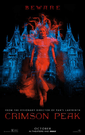
Crimson Peak follows that colour scheme perfectly. It uses colour to bring out 2 images against the simple black backdrop and speaks volumes about the film with very little actually happening on the poster. The grand blue manor tells the audience that this movie falls in the gothic horror genre and is set in the past. It also tells you where the movie will take place and that the movie will feature some claustrophobic scenes but due to the size of the manor will have varied sequences also. By using colour it is easy to turn a simple image into a memorable one especially, by using blood. Blood often sticks with people due to it being a symbol of danger and it makes the movie instantly recognisable horror. Crimson Peak actually suffered from this as it was market very much as a horror when its more of a romance movie with a horror backdrop.
3. A CEntral character for people to identify the movie with
|
|
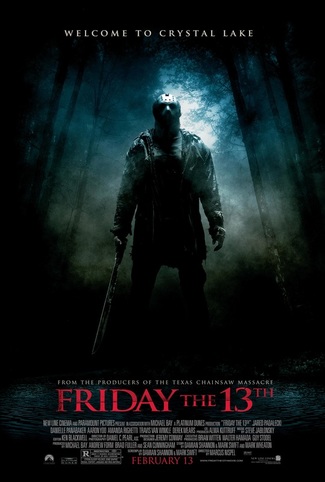
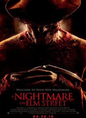
Most successful horror movies have an iconic character at the forefront of the movie. For example Friday the 13th has Jason Vorhees who the movies plot is somewhat based around despite him not being the killer in the first movie. Jason is effective because of his distinctive look with the iconic hockey mask, distinctive weapon and he has a well written character where you can see his point of view. Freddy Krueger is central to every Friday the 13th movie and the key draw to them as well. Freddy has a dark backstory and a fantasy premise where he haunts teenagers nightmare. His backstory is also wove into the plot because he is after the kids whose parents burnt and killed Freddy, turning him into the monster he is now. He is a less likeable character due to him being a peadophile but he is interesting to watch due to his ability to manipulate dreams and his portrayal by horror legend Robert Englund. Our character does not have an elaborate backstory like Freddy, but a strong motive like Jason. We also used a faceless killer and a distinctive weapon to make our character resonate with the audience, just like Jason.
4. AN interesting and unique font
|
|
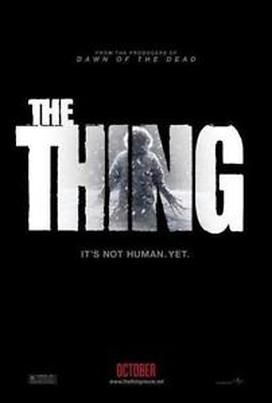
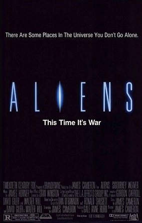
A unique font can easily become the movies iconic image and make it iconic. Aliens uses a very thin font with the I being made to look like an aliens eye. The Thing uses a very classic looking wide text with the key image hidden in the background of the text. We chose a very classic horror font that establishes the film as a slasher straight away. We also wanted a font that looked static to fit with the title. Both these examples use colour very simply whereas we wanted our title to be a bit more developed and thus used a layer of blacks to really bring out the colour and font therefore making it much more than a simple three letter word in red.
Our 1st poster draft
Magazine poster analysis
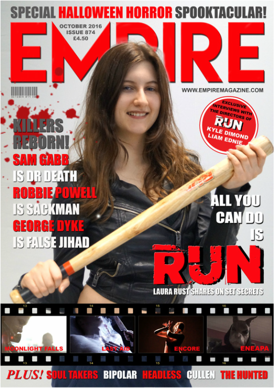
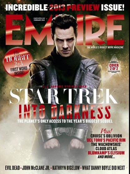
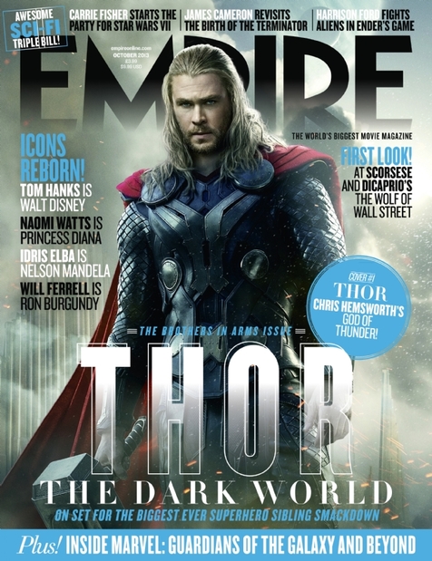
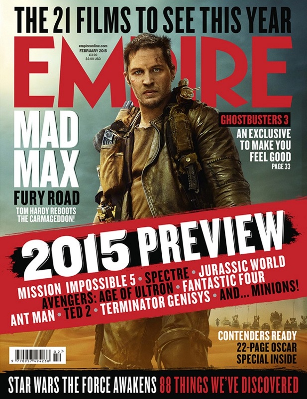
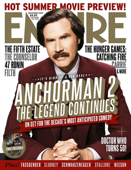
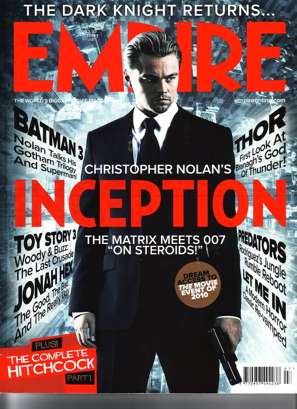
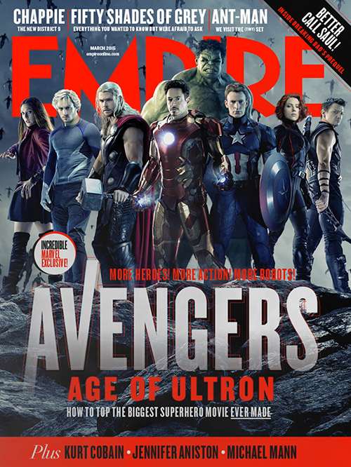
1. a central victim or protagonist
|
|
Both of these posters have characters central to the movies they are in positioned in the middle of the magazine cover with everything else on the front going on around them. We didn't have our title of the movie overlapping the character as we wanted the film reel across the bottom showcasing other movies. We also didn't want to adapt our text like both of these have in order to fit the colour scheme and theme of the issue therefore due to the text we used being quite extravagant if it was any bigger it may be too much for such a small poster. We challenged conventions here by having our victim dressed in killer clothes, an image that is rarely seen on magazine covers
2. A clear, strong theme for the issue
|
|
Most issues of Empire have a clear theme for the issue unless there is a big upcoming release. As our film is a horror film we chose to make the issue a horror movie special for the month of halloween. This made it easier for us to achieve a memorable magazine poster that fits in with other Empire covers. We added a film reel across the bottom previewing other movies similar to the one on the cover. Whereas the one on the left just has a banner across it we chose to use screenshots of the other movies we wanted to promote.
3. An identifiable image
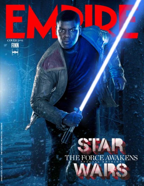
|
|
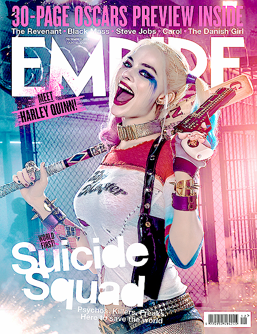
We used our iconic image of the baseball bat with the word "RUN" on it so people can identify our movie against others. We could have used a shot of our killer as this identifiable image but we wanted to build up the status of the baseball bat and for people to be familiar with one of our main protagonists as in horror, protagonists are often overshadowed by the stronger killer character. The poster on the left is a shot of a new character people have not yet seen in a movie but by having one of Star Wars' iconic images on it, the lightsaber, it is instantly recognisable. Another movie that also uses a baseball bat as a weapon is the upcoming Suicide Squad. Ours baseball bat has a different impact as it is used as a tool of fear whilst theirs fits into the character of Harley Quinn who is not using it for fear as this is not what her character is based around.
4. A clear, simple layout
For our magazine cover layout we used the standard Empire magazine layout with one centrepiece picture, other things advertised around the outside of this. Older issues of the magazine often had a top banner and bottom banner which included other things covered in that issue. Another thing we used was a mark of Empire that all the examples above also use. This is where the Empire textis positioned behind the central image and therefore overlaps the P in Empire as seen below.
|
|
By choosing a tried and tested model for our magazine poster we were securing that it would look effective and eye catching thanks to the image that Empire magazine has built up over its 27 years that it has been around.
