The Grudge
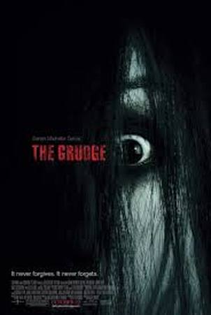
The grudge uses a very simple cover for their film, this is to avoid confusion or having too much happening. They have a photo of an extreme close up of the main antagonist (The Grudge) The close up shows fear in the faec of The Grudge but it also shows phsycoligiacal problems which shows that there will be a good background behind this character. The Background to the cover is just black which has dark, evil, mysterious connotations, The audience can tell just by looking at this cover that is is for a horror film. The Title is in red which has connotations of blood and danger, this is showing the audience that this film will not be boring that it will be exciting with danger, the blood also has connotations of blood so the audience know that death will take part in this film. The slogan for the film is down in the left hand side corner and it says "it never forgives, it never forgets" This is showing the audience that the antagonist of this film has truly evil intentions. The bold font is showing that the grudge is ruthless and a strong antagonist.
The Last Exorcism
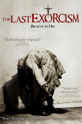
The last exorcism uses a picture of a victim clearly being possesed by a paranormal being, the victim has blood stained clothing but the blood has had the colour taken out to show that the blood is not what the audience is to focus on its the exorcism of the victim, The victim is wearing a white dress and the background is also white, this is showing that the victim was innocent and the darkness of the blood is showing that the innocene has been taken away from the child. The font of Times new Roman is showing is very commonly used in horror but the variation in The Last Exorcism has smudges of blood coming off the title this is showing that death will occur in this film. A lot of horror films use Red text for the title as it has the connotations of blood and death which is what and audience want to know they are going to get from a horror film. The cover uses quotes from newspapers that have seen the film this is going to make the film appeal more to the audience as it is promising that the film will be enjoyable to watch. The use of the Crucifix in the background is highlighting that this film has a religious background.
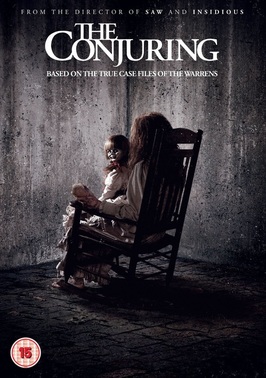
The Conjuring uses a picture of a woman on a rocking chair holding the doll that is the main antagonist in the film. The doll is turned looking at the camera showing the audience that is the main feature of the poster they should focus on, this straight away gives them an idea of who the main antagonist of the film will be. The victim is looking away showing that the doll has control over the victim as she is looking and the victim is not. The poster is very dark and it is all greys and blacks which have very negative connotations showing this will be a very dark horror. The rocking chair is indicating that the origins of the story took place a long time ago. The slogan under the title just say 'based on the true case files of the Warrens' this is rising interest in the film as it is showing the audience that this was a true story and a lot of appeal comes from true stories especially in the horror genre. 'The Conjuring' and 'The Last Exorcism' both have very similar posters in the retrospect that very simple colours have been used and the photos that have been used are simple, both these films were quite popular which suggests that this type of poster is very popular.
Husk
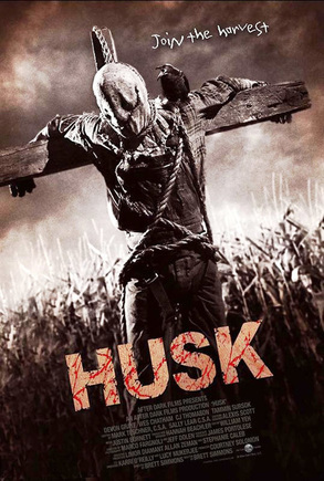
Husk uses a picture of a scarecrow hanging on a cross. The cross is shaped like the crucifix this is indicating that this film may have religious connotations. The title is a faded orange/brown with red blood splattered through it. The font is Ariel bold so that its stands out and is very sharp letting the reader know that this film will be a brutal film. The sky in the background is grey and dark which is indicating that the film will be very dark and mysterious. Husking of corn is the proccess of removing its outer layers, leaving only the cob or seed rack of corn, this is implicating that the film may include skinning or something to do with farming in general. The poster has some similarities to the other ones; the background is faded darker (different from 'The Last Exorcism'), it also is in sepia maybe poiting at the film being set in the past, and it has a very simple image on the front just like the others, this seems to be a popular trend among horror movie posters. The main antagonist in 'The Conjuring' poster is looking at the camera which is different to 'Husk' because he looks away from the camera making it look like he has something to hide
|
|
|
|
|
